Checking ASIC performance differs from functional verification: it's not only about correct outputs but also whether they arrive fast enough, within resource limits, and at expected throughput. Standard performance metrics include latency, throughput, bandwidth, and resource utilization. Best practices treat performance as a first-class metric: define goals, monitor, cover, assert, and link to functional checks. However, identifying the root cause of performance issues remains challenging.
The answer lies in extracting and structuring critical data differently, connecting events in the execution path, enriching them with verification metadata, and making them visual. By adding a time dimension to measurements, architects can quickly assess whether behavior matches expectations, while designers get the focus they need in on critical areas. Better yet, performance data can be compared after each design change, making the impact on every performance parameter visible and turning optimization into an informed, iterative process rather than guesswork.
Standard performance verification checks typically cover:
These are necessary, but they're fundamentally static. They tell you what happened in aggregate, but not when, why, or how it evolved over time. That gap is exactly where performance bugs hide.
Extending your performance measurement toolkit with temporally aware metrics:
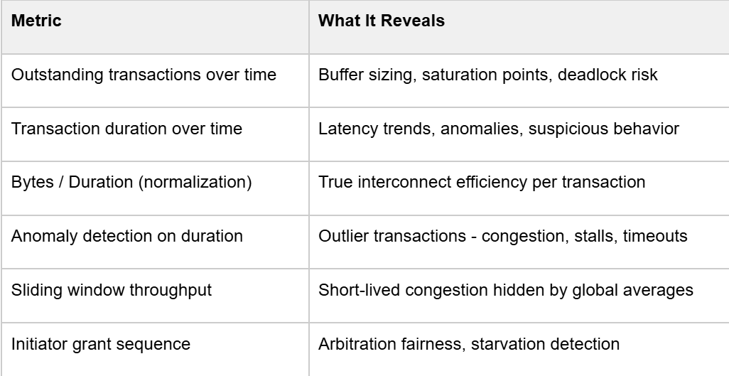
The key insight is adding the time dimension. Instead of asking "what was the max latency?", you ask "when did latency spike, which initiator was affected, and what else was happening at that moment?
The research flow is built around AXI transaction pairing - matching AXI_REQ and AXI_RES events using their unique IDs, then storing the resulting route with start time, end time, duration, byte count, initiator/target index, and any other relevant fields into a structured database. This is the foundation everything else builds on.
From there, three core visualizations give you immediate situational awareness:
1. Transaction Lifecycle Graph
Each line spans from request to response. Dense, parallel lines show that the DUT is under stress. Gaps or sparse regions identify backpressure or traffic generation issues.
2. Outstanding Transactions Graph
A step function over time. You want to see it ramp up quickly to your configured maximum and hold steady, that's your saturation phase. If it never hits max, your test isn't stressing the design properly or there is some limitation in design that prevents maximum utilization.
3. Transaction Duration Graph
Each bar is one transaction. Outliers are immediately visible. This is your first indicator of performance bottlenecks, before you even touch a waveform viewer.
Before trusting any performance number, verify the test itself is exercising what you think it is. A biasing constraint in the test was the reason.
This is a common issue. A performance test that doesn't evenly stress all paths gives you numbers that are meaningless for the paths that were under-exercised. Statistical distribution analysis per initiator and per target should be a mandatory first step before interpreting any performance result.
Among the hundreds of initiators and targets in a complex NoC, let’s choose three initiators to visualize (I0–I2) and illustrate the full transaction lifecycle clearly:
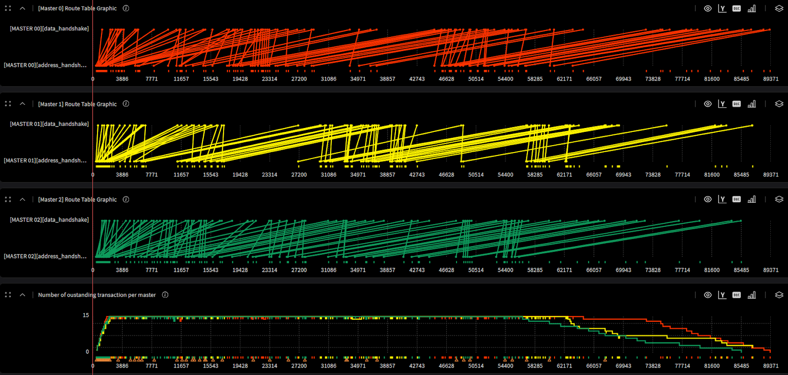
The practical value here for architects is direct: the saturation curve tells you whether your buffer sizing is right. If the system never fully saturates, you may be over-provisioning. If latency degrades sharply before hitting your max outstanding count, you've found your real bottleneck.
Fairness verification is often relegated to a simple round-robin sequence check in RTL. But at the performance level, the question is different: does the arbitration policy result in balanced throughput across all initiators over the duration of the test?
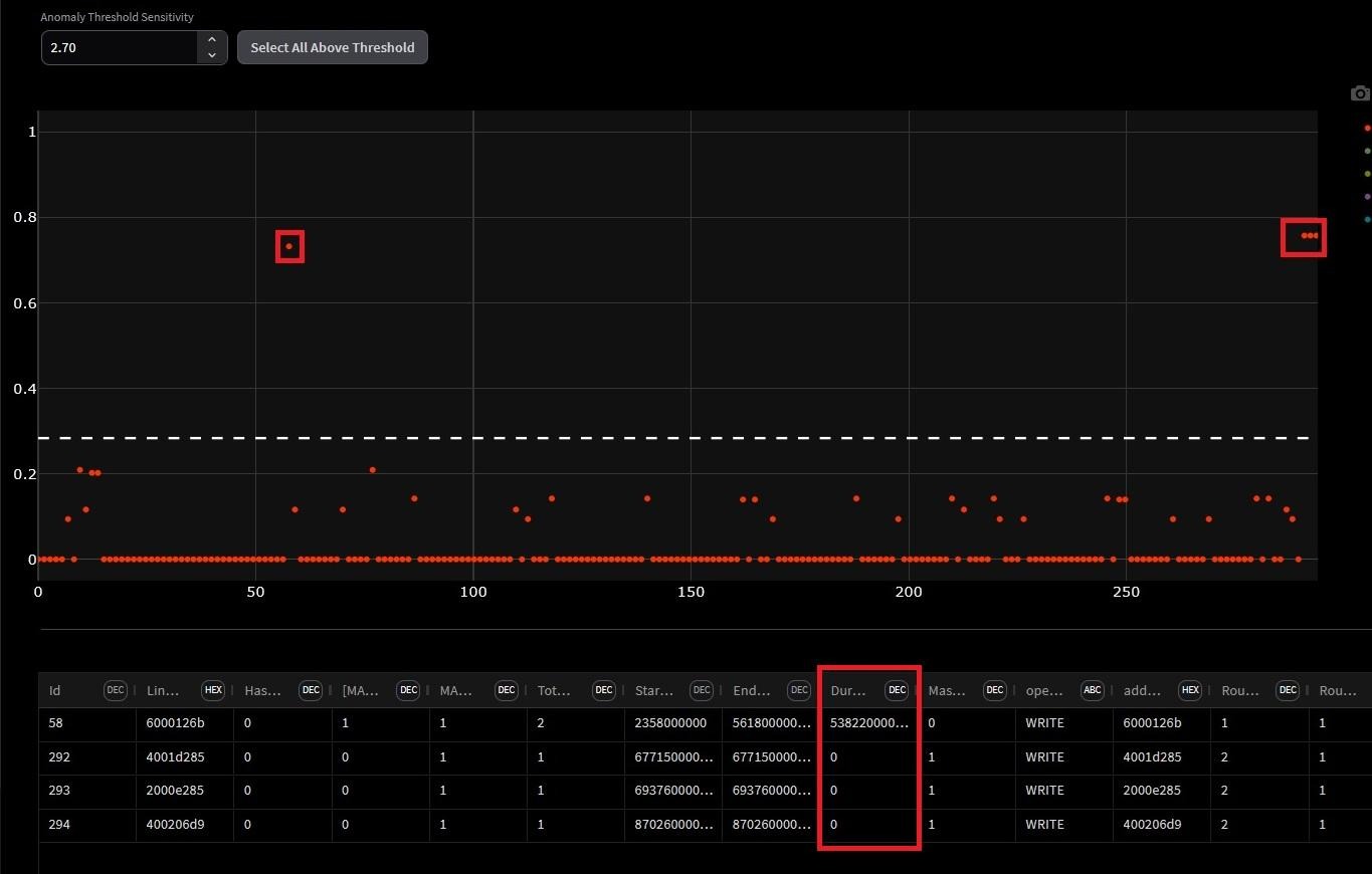
Manual inspection of transaction duration plots doesn't scale. Anomaly detection algorithms across the full route dataset, incorporating initiator index, address, burst length, duration, and other fields can be used to surface statistical outliers automatically.
Two efficiency metrics are proposed that go beyond raw latency:
The normalized duration per byte quantifies the average time required to transfer a single byte, incorporating protocol and arbitration overheads. It is computed as the ratio between the total transaction duration and the number of bytes transferred within that transaction. Lower values of this metric indicate higher data throughput and more efficient interconnect utilization, whereas higher values may point to potential performance bottlenecks within the interconnect.
The highlighted region exposes something counterintuitive: the transaction with the highest normalization value is not the longest transaction in the simulation. It is introducing disproportionate latency relative to the data it actually transferred.
This is exactly what raw latency numbers miss. A transaction can look unremarkable in absolute duration while being severely inefficient in bytes delivered per cycle. This highlighted region gives designers a precise, timestamped target for investigation - the root cause could be arbitration starvation, resource conflict, or a protocol stall, but at least you know exactly where to look.
Transfer efficiency represents the proportion of the transaction duration actively used for data transfer, relative to the ideal case of continuous beat transmission. It is calculated as the ratio of the number of transferred bytes to the total transaction duration. Higher efficiency values correspond to better utilization of available bandwidth, while lower values reflect idle cycles or stalls caused by arbitration delays or resource contention.
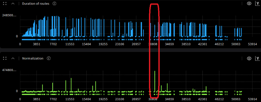
Global averages mask short-lived congestion events. A sliding window computes throughput or efficiency within each window, then plots it as a time series.
The result is a signal that spikes during periods of simultaneous initiator activity and drops during quiet phases. Correlating those spikes with the initiator activity index tells you exactly which combination of concurrent traffic causes your worst-case operating conditions , information that's completely invisible in averaged metrics.
If you're working on NoC, interconnect, or any multi-initiator/multi-target subsystem, here's a concrete checklist derived from this methodology:

Checking ASIC performance differs from functional verification: it's not only about correct outputs but also whether they arrive fast enough, within resource limits, and at expected throughput. Standard performance metrics include latency, throughput, bandwidth, and resource utilization. Best practices treat performance as a first-class metric: define goals, monitor, cover, assert, and link to functional checks. However, identifying the root cause of performance issues remains challenging.
The answer lies in extracting and structuring critical data differently, connecting events in the execution path, enriching them with verification metadata, and making them visual. By adding a time dimension to measurements, architects can quickly assess whether behavior matches expectations, while designers get the focus they need in on critical areas. Better yet, performance data can be compared after each design change, making the impact on every performance parameter visible and turning optimization into an informed, iterative process rather than guesswork.
Standard performance verification checks typically cover:
These are necessary, but they're fundamentally static. They tell you what happened in aggregate, but not when, why, or how it evolved over time. That gap is exactly where performance bugs hide.
Extending your performance measurement toolkit with temporally aware metrics:
The key insight is adding the time dimension. Instead of asking "what was the max latency?", you ask "when did latency spike, which initiator was affected, and what else was happening at that moment?
The research flow is built around AXI transaction pairing - matching AXI_REQ and AXI_RES events using their unique IDs, then storing the resulting route with start time, end time, duration, byte count, initiator/target index, and any other relevant fields into a structured database. This is the foundation everything else builds on.
From there, three core visualizations give you immediate situational awareness:
1. Transaction Lifecycle Graph
Each line spans from request to response. Dense, parallel lines show that the DUT is under stress. Gaps or sparse regions identify backpressure or traffic generation issues.
2. Outstanding Transactions Graph
A step function over time. You want to see it ramp up quickly to your configured maximum and hold steady, that's your saturation phase. If it never hits max, your test isn't stressing the design properly or there is some limitation in design that prevents maximum utilization.
3. Transaction Duration Graph
Each bar is one transaction. Outliers are immediately visible. This is your first indicator of performance bottlenecks, before you even touch a waveform viewer.
Before trusting any performance number, verify the test itself is exercising what you think it is. A biasing constraint in the test was the reason.
This is a common issue. A performance test that doesn't evenly stress all paths gives you numbers that are meaningless for the paths that were under-exercised. Statistical distribution analysis per initiator and per target should be a mandatory first step before interpreting any performance result.
Among the hundreds of initiators and targets in a complex NoC, let’s choose three initiators to visualize (I0–I2) and illustrate the full transaction lifecycle clearly:
The practical value here for architects is direct: the saturation curve tells you whether your buffer sizing is right. If the system never fully saturates, you may be over-provisioning. If latency degrades sharply before hitting your max outstanding count, you've found your real bottleneck.
Fairness verification is often relegated to a simple round-robin sequence check in RTL. But at the performance level, the question is different: does the arbitration policy result in balanced throughput across all initiators over the duration of the test?
Manual inspection of transaction duration plots doesn't scale. Anomaly detection algorithms across the full route dataset, incorporating initiator index, address, burst length, duration, and other fields can be used to surface statistical outliers automatically.
Two efficiency metrics are proposed that go beyond raw latency:
The normalized duration per byte quantifies the average time required to transfer a single byte, incorporating protocol and arbitration overheads. It is computed as the ratio between the total transaction duration and the number of bytes transferred within that transaction. Lower values of this metric indicate higher data throughput and more efficient interconnect utilization, whereas higher values may point to potential performance bottlenecks within the interconnect.
The highlighted region exposes something counterintuitive: the transaction with the highest normalization value is not the longest transaction in the simulation. It is introducing disproportionate latency relative to the data it actually transferred.
This is exactly what raw latency numbers miss. A transaction can look unremarkable in absolute duration while being severely inefficient in bytes delivered per cycle. This highlighted region gives designers a precise, timestamped target for investigation - the root cause could be arbitration starvation, resource conflict, or a protocol stall, but at least you know exactly where to look.
Transfer efficiency represents the proportion of the transaction duration actively used for data transfer, relative to the ideal case of continuous beat transmission. It is calculated as the ratio of the number of transferred bytes to the total transaction duration. Higher efficiency values correspond to better utilization of available bandwidth, while lower values reflect idle cycles or stalls caused by arbitration delays or resource contention.
Global averages mask short-lived congestion events. A sliding window computes throughput or efficiency within each window, then plots it as a time series.
The result is a signal that spikes during periods of simultaneous initiator activity and drops during quiet phases. Correlating those spikes with the initiator activity index tells you exactly which combination of concurrent traffic causes your worst-case operating conditions , information that's completely invisible in averaged metrics.
If you're working on NoC, interconnect, or any multi-initiator/multi-target subsystem, here's a concrete checklist derived from this methodology:
The core argument is one that resonates with any experienced verification engineer and designers: the DUT's behavior is a process that unfolds over time, and measuring only its final state loses most of the information you need to debug it.
Cogita-PRO is built around this principle. By adding temporal structure to performance data and pairing it with anomaly detection and visualization. It transforms performance verification from a pass/fail gate into a genuine debugging tool. With Cogita-PRO, you stop asking "did we hit the throughput target?" and start asking "why did latency spike at that specific cycle, and which initiator was responsible?"
That's the difference between knowing your numbers and understanding your design and it's exactly the gap Cogita-PRO is designed to close.